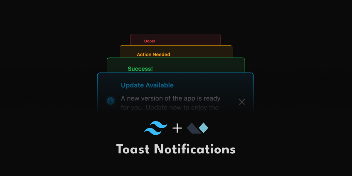
Create User-Friendly Notifications with Tailwind CSS and Alpine JS
Learn the best practices for toast notifications and how to build them with Tailwind CSS and Alpine.js.

Notifications are a great way to keep users informed when something important needs their attention. But if not done right, they can quickly become annoying and distracting. In this post, we’ll discuss the best practices for toast notifications and guide you through creating user-friendly and accessible notifications with Tailwind CSS and Alpine.js.
If you want to skip the best practices, you can jump to "let's start coding"
What Are Toast Notifications?
Toast notifications are brief, non-intrusive messages that appear on the screen to provide feedback to the user. They usually pop up in a corner of the screen, stay for a few seconds, and then disappear.
These notifications are ideal for quick information, like success messages after a form submission or alerts about new messages. Their design should be simple, so they don't distract the user, while still effectively alerting them about important updates.
Best Practices for Toast Notifications
Let's look into some best practices to concider when using toast notificaions:
Keep the message short and informative
Toast notifications should be brief and clear, ideally between 50 to 240
characters.
Focus on the key
message, avoiding unnecessary details. Users should be able to understand the notification at a glance.
Reserve toast notifications for important alerts
Toast notifications should be used for updates that require users
immediate attention.
Avoid
overwhelming users with unnecessary alerts. Reserve them for essential information, like confirmations,
errors, or important updates that users
need to know right away.
Avoid using them for response-required situations
Toast notifications are not ideal for situations that require a response.
For tasks
that need user input, such as forms or decisions, consider using modals or banners instead. They will provide a better
context for users to engage and make sure that
important actions are not dismissed.
Position notifications accordingly
Toast notifications should be positioned in a way that makes them easily
visible but not intrusive.
Common practice for desktop screens is to place them in the top right or bottom right corner. On
mobile devices, they typically appear at the top of the screen. However, the best position may vary
depending on your application.
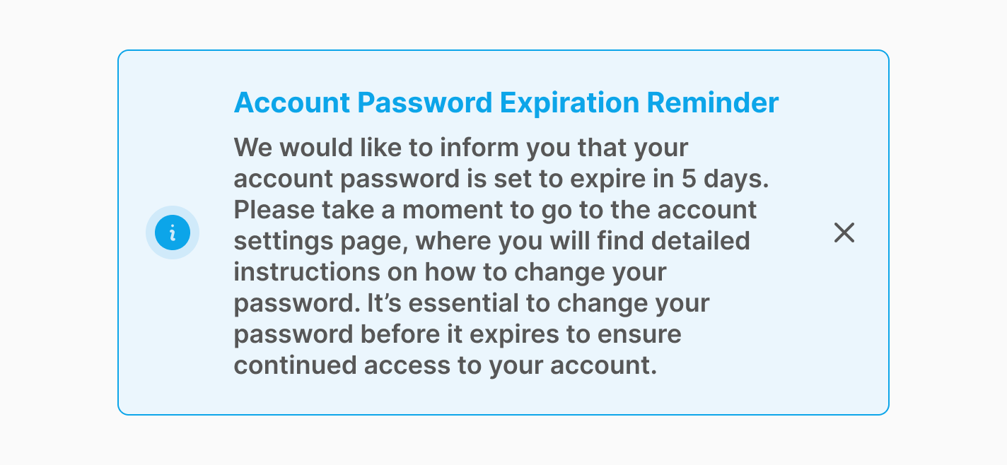
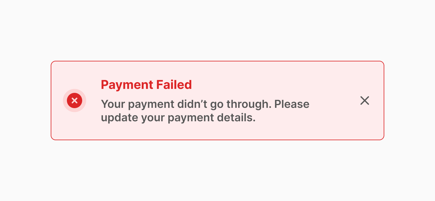
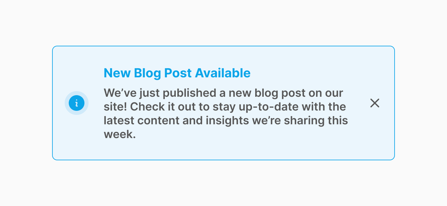
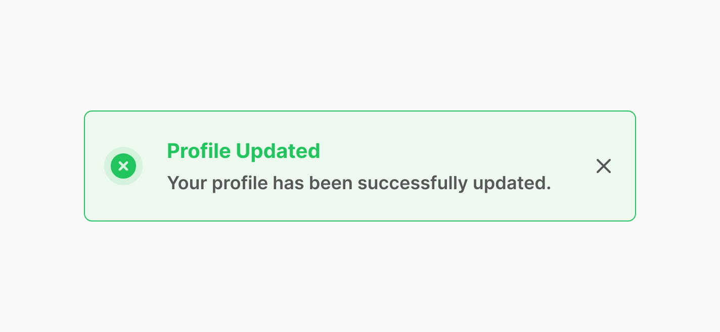
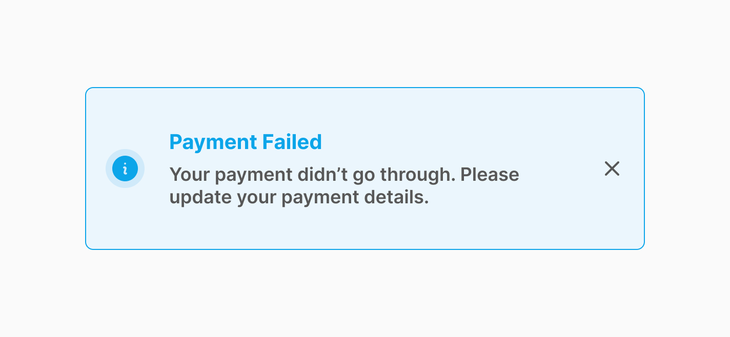
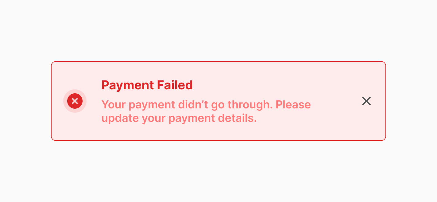
Choose the right types of notifications
Different types of notifications should be used for different purposes.
For example, use
success
notifications for completed actions, error notifications for failed operations, and warning
notifications for potential issues. Each type should have a distinct visual style to help users quickly
identify the nature of the message.

Check the color contrast
Make sure your texts and icons have enough color contrast with their background.
For small text (less than 18pt), aim
for a contrast ratio of at least 4.5:1.
For large text (over
18pt or 14pt bold), a ratio of 3:1 is
enough.
Icons should also have a contrast ratio of at least 3:1.
These guidelines come from the Web
Content Accessibility Guidelines (WCAG) . There are some online tools like WebAIM contrast checker
that you can use to check the color contrast.
Give user enough time to read
It’s important to give users enough time to read and understand toast notifications. Display the message
long enough so it doesn’t feel rushed, but not so long that it overstays its welcome.
Display times vary
depending on the message.
Here are some examples from design
systems:
- Salesforce Lightening Design System: 3 to 5 seconds
- Material Design: 4 to 10 seconds
- SAP Concur: 4 seconds
- HPE Design System: 8 seconds
- Adobe Spectrum: Minimum of 5 seconds
- Penguin UI: 8 seconds
For better usability, pause the auto-dismiss when users hover over the notification to let them control how long they need to view it.
Click on each button to trigger the notification:
Make the notifications accessible for keyboards and screen readers
It's important to make notifications accessible for all users, including those navigating with a keyboard or screen reader.
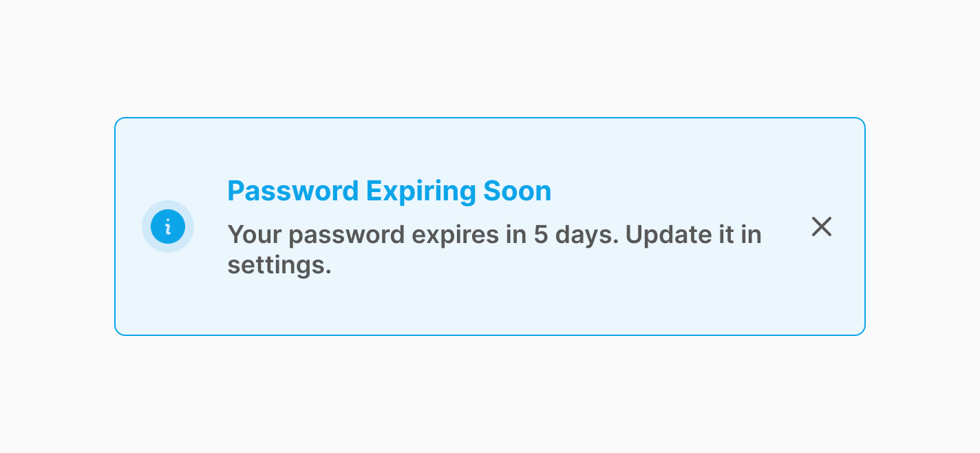
- Assign the correct role:
Use role="alert" for urgent messages that require immediate attention, like error messages. When an element has role="alert", the screen reader will interrupt whatever it’s reading and announce the message immediately.
<div role="alert">Your password is incorrect. Please try again.</div>Use role="status" for non-urgent updates, like progress updates or general status changes. The screen reader won't interrupt its current task but will announce the change when it finishes reading the current content.
<div role="status">Uploading file... 50% complete.</div>- Use ARIA attributes effectively:
aria-live: This attribute defines how "live" an area is, meaning how important it is for the screen reader to announce changes. It can take the values off, polite, or assertive
- assertive: Use this for urgent updates. The screen reader will immediately interrupt its current reading to announce the new content.
<div aria-live="assertive">Error! File upload failed.</div>- polite: Use this for non-urgent updates. The screen reader will wait until it finishes reading the current content before announcing the change.
<div aria-live="polite">File uploaded successfully</div>aria-atomic: This attribute works with aria-live to control whether the whole content or just the updated part is announced:
- When aria-atomic="true", the screen reader will announce the entire element, even if only part of the content changes.
<div aria-live="polite" aria-atomic="true">Upload progress: 75% complete</div>- When aria-atomic="false", only the changed part of the element will be announced.
<div aria-live="polite" aria-atomic="false">Upload progress:<span>%75</span>completed</div>aria-label: If a button (like a dismiss button) only contains an icon, make sure to provide a descriptive label using aria-label to clarify its function for screen reader users.
<!-- Dismiss Button -->
<button type="button" aria-label="dismiss notification">
    <svg xmlns="http://www.w3.org/2000/svg viewBox="0 0 24 24 stroke="currentColor" fill="none" stroke-width="2" class="" aria-hidden="true">
        <path stroke-linecap="round" stroke-linejoin="round" d="M6 18L18 6M6 6l12 12"/>
    </svg>
</button>
- Manage focus:
If the toast notification is critical, shift the user's focus to it when it appears. In situations
requiring immediate action, like critical errors or confirmations, you can trap the focus within the
notification to ensure users address the issue before proceeding.
For non-blocking notifications, like success messages or progress updates, avoid trapping the focus and
allow users to
navigate freely.
Before we start building
Before building anything, let's draft a high-level plan for how we want this component to work:
- We want this notification to be displayed when a JavaScript event is dispatched.
Let's call this event
'notify'.
- The JavaScript event will pass along details, such as the message text, that we need
to display in the
notification.
- We also want the ability to show multiple notifications at the same time, so we need to store
them in
an array and stack them on the user interface.
- The notifications will disappear after 8 seconds of being displayed, so we need to
set up a timeout
for that.
- We also want the notifications to have nice animations and be accessible.
Code Requirements
To build this notification, you'll need the latest versions of Tailwind CSS and Alpine JS. There are various ways to set up Tailwind and Alpine, but to keep this article short, we’ll assume you’ve already installed them. If you'd like to learn more about setting them up in your project, please refer to their documentation.
Let’s start coding
Let’s dive into the good stuff and bring our notification in live.
Step 1: Create the trigger
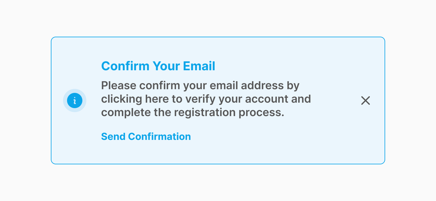
Let's create a trigger that dispatches the 'notify' event to show a toast notification when certain actions occur. This could be when a button is clicked, a form is completed, or any other event you choose. For this example, we'll use a click event.
<button x-on:click="$dispatch('notify', {
    variant: 'info',
    title: 'Update Available',
    message: 'A new version of the app is ready for you. Update now to enjoy the latest features!'
})"
type="button"
class="">
    Notify
</button>
- x-on:click : Alpine directive that performs
an action when the
element is
clicked.
- $dispatch : Alpine magic method that allows you to dispatch browser events. In this case, we're dispatching a custom 'notify' event that includes details such as the notification variant, title, and message.
Step 2: Build the structure of the notification using Tailwind CSS
Before adding functionality with Alpine, let's build our notification UI using Tailwind.
<!-- Stack -->
<div class="">
    <!-- Notification -->
    <div class="" role="status" aria-live="polite" aria-atomic="true">
        <div class="">
            <!-- Icon -->
            <div class="" aria-hidden="true">
                <svg xmlns="http://www.w3.org/2000/svg" viewBox="0 0 20 20" fill="currentColor" class="" aria-hidden="true">
                    <path fill-rule="evenodd" d="M18 10a8 8 0 1 1-16 0 8 8 0 0 1 16 0Zm-7-4a1 1 0 1 1-2 0 1 1 0 0 1 2 0ZM9 9a.75.75 0 0 0 0 1.5h.253a.25.25 0 0 1 .244.304l-.459 2.066A1.75 1.75 0 0 0 10.747 15H11a.75.75 0 0 0 0-1.5h-.253a.25.25 0 0 1-.244-.304l.459-2.066A1.75 1.75 0 0 0 9.253 9H9Z" clip-rule="evenodd" />
                </svg>
            </div>
            <!-- Title & Message -->
            <div class="">
                <h3 class="">Update Available</h3>
                <p class="">A new version of the app is ready for you. Update now to enjoy the latest features!</p>
            </div>
            <!--Dismiss Button -->
            <button type="button" class="" aria-label="dismiss notification">
                <svg xmlns="http://www.w3.org/2000/svg viewBox="0 0 24 24 stroke="currentColor" fill="none" stroke-width="2" class="" aria-hidden="true">
                    <path stroke-linecap="round" stroke-linejoin="round" d="M6 18L18 6M6 6l12 12"/>
                </svg>
            </button>
        </div>
    </div>
</div>
- On larger screens, notifications will appear and stack from bottom to top on the left side of the screen and on mobile devices, they will stack from top to bottom.
- The outer div is the notification stack (a container for multiple notifications).
- By applying pointer-events-none to the parent div and pointer-events-auto to the child div, we exclude any empty areas of the stack (parent) from being affected by pointer events like hover.
- role="status" ensures that screen readers will announce this content, but since it's not urgent, we use status instead of alert.
- aria-live="polite" allows the screen reader to finish its current reading before announcing the message.
- aria-atomic="true" makes sure that entire element is read by the screen reader.
- aria-hidden="true" is used on SVG icons to hide them from screen readers, since they are purely decorative and don't need to be announced to the user.
- Since the dismiss <button> element doesn't have descriptive text, we used aria-label to provide a clear description for screen readers.
Step 3: Adding Functionalities with Alpine JS
Finally, let's add the Alpine magic and make this notification functional.
<!-- Notifications -->
<div x-data="{
        notifications: [],
        displayDuration: 8000,

        addNotification({ variant = 'info', title = null, message = null}) {
            const id = Date.now()
            const notification = { id, variant, title, message }

            // Keep only the most recent 20 notifications
            if (this.notifications.length >= 20) {
                this.notifications.splice(0, this.notifications.length - 19)
            }

            // Add the new notification to the notifications stack
            this.notifications.push(notification)

        },
        removeNotification(id) {
            setTimeout(() => {
                this.notifications = this.notifications.filter(
                    (notification) => notification.id !== id,
                )
            }, 400);
        },
    }" x-on:notify.window="addNotification({
            variant: $event.detail.variant,
            title: $event.detail.title,
            message: $event.detail.message,
})">
    <div x-on:mouseenter="$dispatch('pause-auto-dismiss')"
        x-on:mouseleave="$dispatch('resume-auto-dismiss')"
        class="">
        <template x-for="(notification, index) in notifications"
                x-bind:key="notification.id">
            <!-- root div holds all of the notifications  -->
            <div>
                <!-- Info Notification  -->
                <template x-if="notification.variant === 'info'">
                    <div x-data="{ isVisible: false, timeout: null }"
                        x-cloak
                        x-show="isVisible"
                        class=""
                        x-on:pause-auto-dismiss.window="clearTimeout(timeout)"
                        x-on:resume-auto-dismiss.window=" timeout = setTimeout(() => {(isVisible = false), removeNotification(notification.id) }, displayDuration)"
                        x-init="$nextTick(() => { isVisible = true }), (timeout = setTimeout(() => { isVisible = false, removeNotification(notification.id)}, displayDuration))"
                        x-transition:enter="transition duration-300 ease-out"
                        x-transition:enter-end="translate-y-0"
                        x-transition:enter-start="translate-y-8"
                        x-transition:leave="transition duration-300 ease-in"
                        x-transition:leave-end="-translate-x-24 opacity-0 md:translate-x-24"
                        x-transition:leave-start="translate-x-0 opacity-100"
                        role="status"
                        aria-live="polite"
                        aria-atomic="true" >
                        <div class="">

                            <!-- Icon -->
                            <div class="" aria-hidden="true">
                                <svg xmlns="http://www.w3.org/2000/svg" viewBox="0 0 20 20" fill="currentColor" class="" aria-hidden="true">
                                    <path fill-rule="evenodd" d="M18 10a8 8 0 1 1-16 0 8 8 0 0 1 16 0Zm-7-4a1 1 0 1 1-2 0 1 1 0 0 1 2 0ZM9 9a.75.75 0 0 0 0 1.5h.253a.25.25 0 0 1 .244.304l-.459 2.066A1.75 1.75 0 0 0 10.747 15H11a.75.75 0 0 0 0-1.5h-.253a.25.25 0 0 1-.244-.304l.459-2.066A1.75 1.75 0 0 0 9.253 9H9Z" clip-rule="evenodd" />
                                </svg>
                            </div>

                            <!-- Title & Message -->
                            <div class="">
                                <h3 x-cloak
                                    x-show="notification.title"
                                    class=""
                                    x-text="notification.title"></h3>

                                <p x-cloak
                                    x-show="notification.message"
                                    class=""
                                    x-text="notification.message"></p>
                            </div>

                            <!--Dismiss Button -->
                            <button type="button"
                                class=""
                                aria-label="dismiss notification"
                                x-on:click="(isVisible = false), removeNotification(notification.id)">
                                <svg xmlns="http://www.w3.org/2000/svg viewBox="0 0 24 24 stroke="currentColor" fill="none" stroke-width="2" class="" aria-hidden="true">
                                    <path stroke-linecap="round" stroke-linejoin="round" d="M6 18L18 6M6 6l12 12"/>
                                </svg>
                            </button>
                        </div>
                    </div>
                </template>
            </div>
        </template>
    </div>
</div>
- x-data: this initializes Alpine.js on the element.
- notifications: an array that will store multiple notifications.
- displayDuration: the time (in milliseconds) that the notification will remain visible before disappearing, in this case, 8 seconds.
- addNotification(): This function creates a new notification and adds it to the notifications array. You can also define how many notifications you want to keep in the stack, in this case the last 20.
- removeNotification(id): This function removes a notification by its unique id. There is a 400ms delay before removing it to let the exit animations to complete.
- x-on:notify.window: This listens for the 'notify' event on the window. When triggered, it calls the addNotification with event details.
- x-on:mouseenter="$dispatch('pause-auto-dismiss')": This triggers the custom event 'pause-auto-dismiss' when the user hovers over the element.
- x-on:mouseleave="$dispatch('resume-auto-dismiss'): This dispatches the custom event 'resume-auto-dismiss' when the user's mouse leaves the element.
- <template x-for="(notification, index) in notifications">: This sets up a loop to go through the notifications array and renders each notification.
- x-bind:key="notification.id": This binds a unique key to each notification using the id from the notification object. This helps Alpine.js track each item efficiently, especially when items are added or removed.
- <template x-if="notification.variant === 'info'>: This conditionally renders the notification UI only if the variant of the current notification is set to 'info'. It doesn't make much sense in this example, but if you dispatch different notifications like info, success and danger, this will make sure that the correct one will render.
- x-data="{ isVisible: false, timeout: null }": This initializes Alpine.js data on each notification. The isVisible property is set to false, indicating that the notification is initially hidden. The timeout property is set to null, which will later be used to manage the auto-dismiss timing for the notification. You can just use the array to add or remove the notification, but this way you can animate them.
- x-cloak: This attribute hides the element until Alpine.js has fully initialized. It prevents the notification from flashing before the JavaScript takes effect. Learn more about it on Alpine's documentation
- x-show="isVisible": This directive controls the visibility of the element based on the value of the isVisible property.
- x-on:pause-auto-dismiss.window: This directive listens for the custom pause-auto-dismiss event on the window. When the event is triggered, it executes the action clearTimeout(timeout), which stops the automatic dismissal of the notification.
- x-init: This directive initializes the component. First, it uses $nextTick to wait for the next DOM update and then sets isVisible to true, making the notification visible. After that, it sets a timeout to automatically hide the notification after a specified duration (displayDuration).
- x-transition:enter: This tells the notification how to animate in when it appears.
- x-transition:enter-start: This sets where the notification starts before it shows up. It begins a bit lower, at translate-y-8, so it slides up into view.
- x-transition:enter-end: This is the final position of the notification after it finishes sliding in. It will end up in its regular spot with translate-y-0.
- x-transition:leave: This handles how the notification will animate out when it disappears.
- x-transition:leave-start: This sets the starting point for the notification before it begins to leave. It will be fully visible with translate-x-0 opacity-100.
- x-transition:leave-end: This is where the notification ends up after it leaves. On the small screens it will fade out to left, and on the larger screens it will fade out to right.
- x-show="notification.title": This means the title will only be shown if there’s actually a title value present in the notification details. If there’s no title, it will stay hidden.
- x-text="notification.title": This sets the text content of the element to whatever the notification's title is. So, if the title exists, it will display it here!
- x-show="notification.message": This will only show the message if it exists. So, if there's no message, this part of the notification won't be displayed!
- x-text="notification.message": This will display the message text inside the notification. If there’s a message, it shows up here!
- x-on:click="(isVisible = false), removeNotification(notification.id)": When clicked (on the dismiss button), it will hide the notification by setting isVisible to false and remove it from the notifications list.
Let's put everything toghether
Let's combine our trigger with the notification to put everything toghether.
<div x-data>
    <!-- Trigger Button -->
    <button x-on:click="$dispatch('notify', {  variant: 'info', title: 'Update Available', message: 'A new version of the app is ready for you. Update now to enjoy the latest features!' })" type="button" class="">Notify</button>

    <!-- Notifications -->
    <div x-data="{
            notifications: [],
            displayDuration: 8000,

            addNotification({ variant = 'info', title = null, message = null}) {
                const id = Date.now()
                const notification = { id, variant, title, message }

                // Keep only the most recent 20 notifications
                if (this.notifications.length >= 20) {
                    this.notifications.splice(0, this.notifications.length - 19)
                }

                // Add the new notification to the notifications stack
                this.notifications.push(notification)

            },
            removeNotification(id) {
                setTimeout(() => {
                    this.notifications = this.notifications.filter(
                        (notification) => notification.id !== id,
                    )
                }, 400);
            },
        }" x-on:notify.window="addNotification({
                variant: $event.detail.variant,
                title: $event.detail.title,
                message: $event.detail.message,
    })">
        <div x-on:mouseenter="$dispatch('pause-auto-dismiss')"
            x-on:mouseleave="$dispatch('resume-auto-dismiss')"
            class="">
            <template x-for="(notification, index) in notifications"
                    x-bind:key="notification.id">
                <!-- root div holds all of the notifications  -->
                <div>
                    <!-- Info Notification  -->
                    <template x-if="notification.variant === 'info'">
                        <div x-data="{ isVisible: false, timeout: null }"
                            x-cloak
                            x-show="isVisible"
                            class=""
                            x-on:pause-auto-dismiss.window="clearTimeout(timeout)"
                            x-on:resume-auto-dismiss.window=" timeout = setTimeout(() => {(isVisible = false), removeNotification(notification.id) }, displayDuration)"
                            x-init="$nextTick(() => { isVisible = true }), (timeout = setTimeout(() => { isVisible = false, removeNotification(notification.id)}, displayDuration))"
                            x-transition:enter="transition duration-300 ease-out"
                            x-transition:enter-end="translate-y-0"
                            x-transition:enter-start="translate-y-8"
                            x-transition:leave="transition duration-300 ease-in"
                            x-transition:leave-end="-translate-x-24 opacity-0 md:translate-x-24"
                            x-transition:leave-start="translate-x-0 opacity-100"
                            role="status"
                            aria-live="polite"
                            aria-atomic="true" >
                            <div class="">

                                <!-- Icon -->
                                <div class="" aria-hidden="true">
                                    <svg xmlns="http://www.w3.org/2000/svg" viewBox="0 0 20 20" fill="currentColor" class="" aria-hidden="true">
                                        <path fill-rule="evenodd" d="M18 10a8 8 0 1 1-16 0 8 8 0 0 1 16 0Zm-7-4a1 1 0 1 1-2 0 1 1 0 0 1 2 0ZM9 9a.75.75 0 0 0 0 1.5h.253a.25.25 0 0 1 .244.304l-.459 2.066A1.75 1.75 0 0 0 10.747 15H11a.75.75 0 0 0 0-1.5h-.253a.25.25 0 0 1-.244-.304l.459-2.066A1.75 1.75 0 0 0 9.253 9H9Z" clip-rule="evenodd" />
                                    </svg>
                                </div>

                                <!-- Title & Message -->
                                <div class="">
                                    <h3 x-cloak
                                        x-show="notification.title"
                                        class=""
                                        x-text="notification.title"></h3>

                                    <p x-cloak
                                        x-show="notification.message"
                                        class=""
                                        x-text="notification.message"></p>
                                </div>

                                <!--Dismiss Button -->
                                <button type="button"
                                    class=""
                                    aria-label="dismiss notification"
                                    x-on:click="(isVisible = false), removeNotification(notification.id)">
                                    <svg xmlns="http://www.w3.org/2000/svg viewBox="0 0 24 24 stroke="currentColor" fill="none" stroke-width="2" class="" aria-hidden="true">
                                        <path stroke-linecap="round" stroke-linejoin="round" d="M6 18L18 6M6 6l12 12"/>
                                    </svg>
                                </button>
                            </div>
                        </div>
                    </template>
                </div>
            </template>
        </div>
    </div>
</div>
More examples
Check out our toast norifications for more examples with different variants.