Exciting Updates in Penguin UI with Tailwind CSS v4.0
Discover the latest updates and improvements in Penguin UI as we embrace the new features of Tailwind CSS v4.0

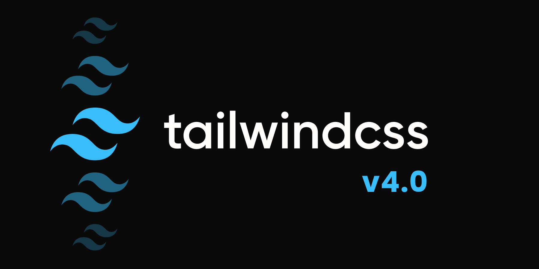
We're excited to announce that Penguin UI has been fully updated to support Tailwind CSS v4! This major update brings significant improvements to our component library, making it even more powerful and developer-friendly.
What's New in Tailwind CSS v4?
Tailwind CSS v4 introduces several game-changing features, you can find all of them in the official Tailwind CSS v4
release notes.
Here are some of the top changes:
- Enhanced Performance: Significant improvements in build times and runtime performance.
- CSS-first configuration: Tailwind is now a CSS-first framework, which means you can use it without any need for tailwind.config.js.
- Theme variables: V4 introduces a new theming system that allows you to define custom colors, spacing, and other design tokens.
Penguin UI Updates
We've completely revamped Penguin UI to take full advantage of Tailwind v4's capabilities:
New theming system
Tailwind v4 introduces a new theming system that lets you define design
tokens as variables directly in your CSS file.
To take advantage of this, we've introduced a
modern theming
method that makes it easy to use and customize our themes in your code or even
use multiple themes at the same time.
Here's a quick example of a button with modern theming system:
Classic vs Modern Code Style
The difference between the two versions is how they're written. The classic version uses older-style classes like 'text-red-500' for styling, while the modern version, uses CSS variables and semantic names like 'text-primary' for theming. It's important to note that 'Classic' doesn't mean an older version—they both use Tailwind V4. Tell me more.
<!-- primary Outline Button -->
<button disabled" type="button" size="" ="">Primary</button>

<!-- secondary Outline Button -->
<button disabled" type="button" size="" ="">Secondary</button>

<!-- alternate Outline Button -->
<button disabled" type="button" size="" ="">Alternate</button>

<!-- inverse Outline Button -->
<button disabled" type="button" size="" ="">Inverse</button>

<!-- info Outline Button -->
<button disabled" type="button" size="" ="">Info</button>

<!-- danger Outline Button -->
<button disabled" type="button" size="" ="">Danger</button>

<!-- warning Outline Button -->
<button disabled" type="button" size="" ="">Warning</button>

<!-- success Outline Button -->
<button disabled" type="button" size="" ="">Success</button>
/* light theme */
    --color-surface: var(--color-);
    --color-surface-alt: var(--color-);
    --color-on-surface: var(--color-);
    --color-on-surface-strong: var(--color-);
    --color-primary: var(--color-);
    --color-on-primary: var(--color-);
    --color-secondary: var(--color-);
    --color-on-secondary: var(--color-);
    --color-outline: ;
    --color-outline-strong: var(--color-);

    /* dark theme */
    --color-surface-dark: var(--color-);
    --color-surface-dark-alt: var(--color-);
    --color-on-surface-dark: var(--color-);
    --color-on-surface-dark-strong: var(--color-);
    --color-primary-dark: var(--color-);
    --color-on-primary-dark: var(--color-);
    --color-secondary-dark: var(--color-);
    --color-on-secondary-dark: var(--color-);
    --color-outline-dark: var(--color-);
    --color-outline-dark-strong: var(--color-);

    /* shared colors */
    --color-info: var(--color-);
    --color-on-info: var(--color-);
    --color-success: var(--color-);
    --color-on-success: var(--color-);
    --color-warning: var(--color-);
    --color-on-warning: var(--color-);
    --color-danger: var(--color-);
    --color-on-danger: var(--color-);

    /* border radius */
    --radius-radius: var(--radius);
Checkout "how to set up theme" to learn more about the new theming system.
Some syntax changes
In Tailwind v4, updates have been made to the default blur, shadow, and rounded scales to ensure every utility has a clear named value:
- Blur:
- blur is now blur-sm
- blur-sm is now blur-xs
- Shadow:
- shadow is now shadow-sm
- shadow-sm is now shadow-xs
- Rounded:
- rounded is now rounded-sm
- rounded-sm is now rounded-xs
There are some other syntax changes, you can find the full list in the official Tailwind CSS v4 release notes. We've updated all of the components to use the new syntax.
Installation & Upgrade
Penguin UI components work
by copying and pasting the code into your project, this way you have the full
ownership of the code and can customize it as you want. Therefore, for your existing projects other than
upgrading from Tailwind v3 to v4, you don't need to do anything else.
If you are upgrading an existing project and wish to use the modern theming system, then you need to
replace your preset classes (like bg-blue-500) with utility
classes (like bg-primary) and set up your theme in the CSS file.
For new projects, once you installed Tailwind CSS v4 and Alpine JS, you also need to set up your theme
for the modern method to work properly.
Where can I fond the old components?
To view the old components compatible with Tailwind v3.4, please visit this GitHub repository.